


How to Make Awesome Websites: Part 2
This article continues from How to Make Awesome Websites: Part 1. In part one, I covered how the fundamentals of design and the creative process have an impact on making awesome websites. In this article, I'm going to touch on UX, color scheming, the later stages of planning, wireframes, templates, and other important topics.
User Experience Design (UX Design)
Awesome websites offer top-notch usability. UX design is a heavy subject that's beyond the scope of this article. True UX design can be tough. It involves extensive research, asking 100+ questions, and performing a series of user tests. If you're solo or in a small team, typically you don't have the time/money/resources/patience for proper UX planning. Rather, I'm going to save you from all that and direct you to this great website: GoodUI. It's a collection of tried and true nuggets of good UX practices. Nothing is complicated, these are easy suggestions any web designer can take into practice.
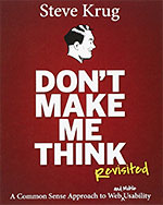
If you liked GoodUI then I highly recommend reading Steve Krug's Don't Make Me Think. It's an excellent book. I'd go as far as to say it's probably the #1 book for web professionals. It's a short, easy read; full of examples and amusing illustrations. The usability concepts it presents are simple and practical. The book's so popular it's now in its third edition.
If you want to dive deeper into UX design, I recommend Usability.gov and reading Jodie Moule's Killer UX Design. Also, check out Top 10 Skills That Separate Real UX Designers from Wannabes to learn about what it takes to become a serious UX designer.
Need to Know List
Awesome websites are born from having an intimate understanding of the client's audience/needs/wants/requirements. The following is a suggested list of questions to ask your client when starting a new project.
- Who is the intended audience?
- What is their age group and demographic?
- Is the audience computer literate?
- What brand guidelines must be followed?
- Are there color or design guidelines?
- How closely do we need to stick with the brand's identity?
- What tone do we need to establish?
- What is the site's intended purpose?
- Are there marketing goals?
- Is the client trying to sell a product or service?
- What are some of the goals that the client hopes to achieve with the site?
- What is the site's content?
- What is the subject matter of the content?
- Is the content structure complex?
- How much content will be on the site?
- Will the content constantly change or will it be relatively static?
- What additional restrictions are placed on the project?
- Does it need to be viewed on legacy browsers or special devices?
- Will the site be updated internally?
- Does the site form part of a larger campaign?
- Does the site need to work in conjunction with other media like print or film?
- What should we avoid?
- What is off limits?
- Should we avoid certain design choices?
- What is the project budget?
- Is the amount the client wants to spend realistic for the project's requirements?
- What is the project timeline and production schedule?
- Does the client have realistic expectations for how long the project will take to complete?
- What benchmarks need to be met?
- What responsibilities will the client be taking?
Please don't limit yourself to these questions. There's no perfect set of questions for a client. I recommend exploring other collections of questions to ask a client for a new project.
Choosing the Color Palette
Psychology of Color
The first step for choosing the right colors for your website is to understand the psychology of color. I've collected the following superb articles that I recommend reading:
- An Introduction to Color Theory for Web Designers - A nice introduction. Touches on the importance of being mindful to contrast and vibrancy.
- The Psychology of Color - Explains what each color means.
- Why Is Facebook Blue? The Science Behind Colors In Marketing - Goes into more detail about what each color means.
- Find the perfect colour for your website - Explains what each color means in different countries.
Color Scheming Tools
The second step is using color tools to help you pick colors. I recommend three.
- Kuler - Most designers seem to prefer is Kuler. With Kuler, you can either plug in a base color and adjust the color wheel to explore palette variations, or you can explore the massive library of user submitted color palettes. There are plenty of Kuler video tutorials to help you use it.
- Adobe Illustrator - Illustrator's Color Guide panel is fantastic. When you choose a base color and explore the Color Guide, Illustrator has a list of color palettes ready for you. There are plenty of Color Guide video tutorials to help you use it.
- COLOURlovers - This is a very active community of people who love color. They offer hundreds of color palettes and fashion patterns, organized by common categories.
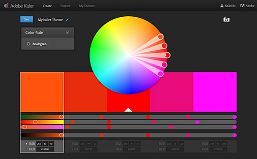
Adobe Kuler
Mood Boards
Mood boards are a collection of visual elements and motifs that will be present in the website's design. They help give a feel for the website. Mood boards should include examples of the typography, color palette, patterns, shapes, symbols, and imagery that will be used in the design. A mood board should provide enough visual information to explain design intentions to your client/boss. Mood boards are typically created in Photoshop or Illustrator.
I consider mood boards optional. If you're in an environment that doesn't care how you make a website, a mood board is a bit overkill.
Design Galleries
Looking for inspiration? The following is a list of popular design galleries that showcase user submitted work to inspire others.
- Behance - Adobe's famous showcase site of creative work.
- Unmatched Style - What I love about this site is that the websites being showcased are practical. They're designs that any web designer can reproduce.
- CSSMania - Another design gallery site.
- Typeverything - A design gallery site that focuses on the love for type.
- Abduzeedo - Stunning collections of creative work.
SiteMaps
It's important to organize the intended structure of the website. Sitemaps, also called outlines or flowcharts, are essential for establishing the hierarchy of the pages in the website. They're a simple chart that shows which level each page resides. It doesn't need to be fancy. You can use Microsoft Word's Flowchart builder (first, rotate the page to landscape). For the chart ask yourself: Where does the homepage lead to? Where do section pages lead to? And so on. Advertising agencies typically show sitemaps in the beginning as part of the proposal to clients. Below is an example of an advertising agency grade sitemap.
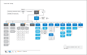
Sample sitemap (PDF Download, 256 KB)
Wireframes
It's possible to make an awesome website without wireframes, but wireframes save you time and headaches! A website wireframe is a super-low fidelity design that focuses on content hierarchy, general layout, and functionality. As shown in the wireframe samples here, wireframes are just lorem ipsum type, boxes, and image placeholders. When drafting a wireframe you should ask yourself:
- What content needs to be on the page?
- How do the different pieces of content relate to one another?
- How might they possibly be arranged?
- How should the user interact with the content?
Adobe Illustrator is good for creating wireframes from scratch. C.Rowe's famous Wireframe & UI Kit is an EPS with a great collection of objects for wireframes in Illustrator. However, there are several wireframing applications out there that are far more efficient than Illustrator. These applications even let you make fully interactive mock websites with wireframes.
Funny story: I once had a boss who really liked my wireframes. I'm talking, he perceived the wireframes as the final design and wanted the website to look exactly like them, with the grayscale palette and all. Talk about awkward.
Pre-made Templates & CMS's
Why bother going through the trouble of making an awesome website when you can just buy one? Or what about installing WordPress and downloading a free template? Well, templates can be a gamble. While templates present awesome options, the final product may not be so awesome. The problem comes in with customization. A template can hold you back if it's based on a technology you're not entirely familiar with or the technology by nature has limitations.
As web designers it's important to challenge ourselves with new technologies for growth, but as long as it's within reason. Good communication with your client/boss and asking the right questions goes a long way to fully understand what special customizations are expected with the website. You can make an awesome website with a template and/or CMS when you're absolutely certain you can customize it for every project requirement.
Responsive or Mobile?
That's the big question these days for making your website mobile friendly: do you make your website responsive or do you make a dedicated mobile site? The right decision determines whether or not you'll have an awesome website on mobile devices. I've collected several articles on the subject:
- Separate Mobile Website Vs. Responsive Website
- What is adaptive web design (AWD) and when should you use it?
- When Responsive Design is Not an Option: a Checklist for Optimizing Your Mobile Site
In my experience, I've found that a website should have a dedicated mobile version if there's a lot of content. Most particularly, if a website has a lot of tabular data. Responsive layouts work best with small-to-medium sized websites that don't have a lot of content on every page.
When Politics Hold Back Innovation
It's challenging to make awesome websites when you're stuck in an environment that doesn't welcome new ideas and trying new technologies. It's a dilemma I'm all too familiar with. Pushing any kind of change in any company is tough. From a corporate standpoint, all the points in this article pertaining to planning fall under marketing (even though they're not supposed to). If say, you as a web designer propose UX strategies, you may not be taken seriously since you're not a marketer.
What I've learned about proposing new ideas or new technologies is to focus on the benefits and potential increase in revenue. In other words, money talks. Do some research and prepare a good argument to perk the interest of others to listen to your idea.
Awesome Links
This article isn't meant to touch on the coding phase, but I'm going to share with you a few helpful links in that department. As mentioned already, Bootstrap is all the rage for making responsive websites. I use it for the majority of my projects. If you're using WordPress you have options for Bootstrap with WordPress. Bootstrap, however, is overkill for small projects. In such cases, I reference Responsive Patterns for quick snippets. As for jQuery, for browsing plugins I like to use Unheap. It's the largest catalog of (good) jQuery plugins.
A Full Creative Process
Before I conclude the article I'm going to leave you with something helpful that you can keep for reference. John Furness of Simple Square created a timeline of all the steps that advertising agencies go through to create a website:
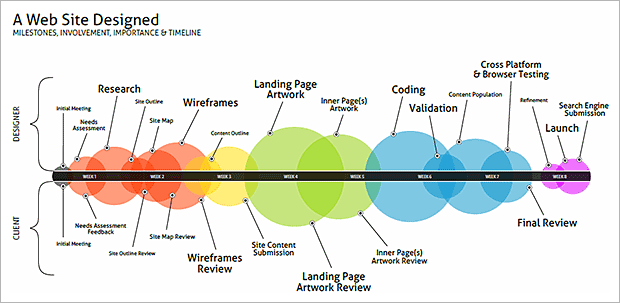
A Web Site Designed (PDF Download, 122 KB)
In addition, here's a real advertising agency's statement of work. It'll give you an idea of what an agency actually goes through to create an awesome website:
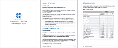
Statement of Work (PDF Download, 1.58 MB)
Conclusion
I hope with this article I've inspired you to make awesome websites. Process and planning are everything. When I was younger I didn't care about these things. I would just jump into Photoshop and push pixels. Age and experience had taught me the importance of planning and to aspire to have an intimate understanding of design.
As mentioned in part 1, this article was inspired by Giovanni DeFeterici's The Web Designer's Roadmap. It's an excellent book. I recommend it if you want to learn more about the points brought up in this article, and more. The book follows the creation of a website from start to finish, as an example to illustrate everything taught in the book.
For further reading I recommend the following:
- A Modern Designer's Canvas - A very well written article about what it takes to be a web professional these days and how to produce quality work.
- 18 pivotal web design trends for 2014 - Excellent article. This is the way things are going.
- 15 Examples of Brilliant Homepage Design - Slightly old from 2012, but good concepts are presented.
- Useful Talks And Videos From Web Design Conferences - A great collection of informative and inspirational videos.