


A piece of my resume
Designers have an immense amount of freedom with their resume - they get to design it! They can make it highly creative or elegantly simplistic. There is no right or wrong way to design a resume. Check out these links to get an idea how designers typically make their resumes:
- Graphic design resumes on Behance
- Web design resumes on Behance
- “designer resume” on Google Images
- “designer resume” on Pinterest
Cool resumes, huh? Typically designers create their resume for print. Other designers create long, vertical resumes exclusively for viewing online. However, I believe it's essential for a resume to be print friendly (on a single sheet). Most, if not all, potential employers would want to print out your resume for reference - or expect you to bring a copy for them.
I recently refreshed my resume with a complete overhaul. I want to share with you my process as to how I went about creating it. This article is not about creating the perfect, winning resume. Due to the freedom involved, there isn't really a golden formula for creating the perfect designer resume. Rather, my goal with this article is to help you think about how to design your resume by showing you how to make a solid plan. I can help guide you toward making an awesome resume.
Step 1: Brainstorm
The first step is to brainstorm. You need to find out what you want to do with your resume. What's your goal with it? Of course, the obvious goal is to come up with a great resume to impress potential employers. But that's way too vague to help you with the creative process. You need to ask yourself more specific questions; questions such as:
- What kind of personality do you want to express with the style of your resume?
- What are you most proud of about yourself? Is it your valuable skills? Your vast knowledge of tools? Your impressive professional history? Or something else?
The answers to those questions will help you find the true goal of your resume.
So what are my answers to these questions? As an adult I still love cartoons. I want to express a fun personality with my resume. Hence, I don't want something too simple. I'm willing to make my design a little busy to get my point across. What I'm most proud of about myself are my skills and professional history. I'm aiming to more or less give them 50/50 priority in my resume. I care least about my library of tools/technical skills so I will be giving them less priority. Why? Well, every designer knows Photoshop (and all the other common programs for web design). I don't want to spend too much valuable real estate on such common skills.
Step 2: Research
With your goals in mind, the next step is to find awesome resumes for ideas and inspiration. You can use the links I provided in the beginning of this article. I recommend picking 3-5 resumes of interest. Not only should these resumes look good to you, but they should also be aligned with your vision for your resume. In addition, focus on how these designers decided to display everything. Notice how each resume has a different approach toward displaying skills and experience. Some designers use bar graphs or other graph-like designs. Look for ideas that call out to you.
Particularly, pay attention to what designers include and exclude. Notice how a lot of designer resumes don't have job descriptions in their work history. Notice how not everyone includes their hobbies/interests, accomplishments, or an introduction paragraph. It's up to you to decide what you think is most important. Again, there is no wrong or right way to make a resume.
I picked the following three resumes to inspire me:

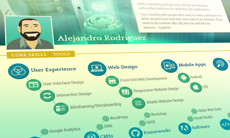
Paola's resume is my favorite! It's exactly what I want to do. It's fun and cartoony, yet simple and clean. She uses bright, vibrant colors. It's cute. I love how she is displaying her core skills with 8 simple icons. I especially like her approach with her work history by using a colorful timeline.
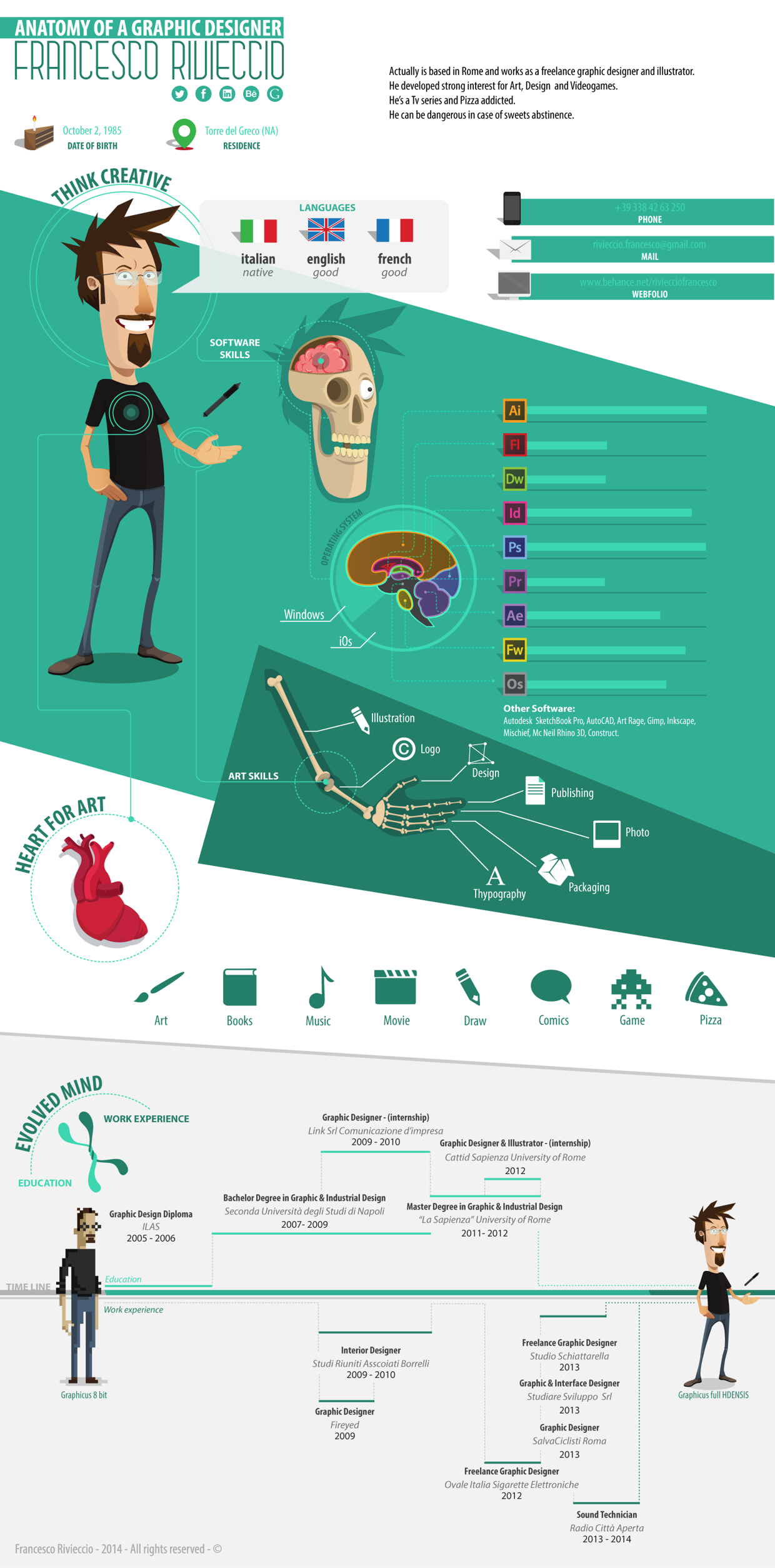
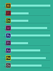
Francesco's resume is very cool. Using his superb illustration skill he displays his skill set like a medical diagram. It's a neat idea. His resume is definitely fun to browse.

What I really like about Varun's resume is his approach to displaying his skills. He merged his core skills and general technical skills into one section. He organized them into groups, listing exactly what he specializes in with a short description. His software-based technical skills are displayed with an interesting hexagon based graph.
Step 3: Outline
With your goals and resumes of inspiration in hand, now's the time to get organized. Grab a sheet of paper or open a new Google Doc and create an outline of everything you want on your resume. In other words, type up a text-only version of your resume.
Sample Outline
You can use the following as a guide. Please keep in mind, though, that this sample outline is NOT intended to be a one-size-fits-all guide for everyone. This is just to help you get started.
- Introduction - Type 2-3 small paragraphs
- Core Skills - List 4-8 of your general skills
- Technical Skills - List all the programming languages, software, and tools that you know best
- Work History - List your employment history
- Education - List your school(s) and degree(s)
- Languages - If you know more than one language, list 'em
- Awards/Accomplishments - List all awards you've won or any other significant feats
- Most of us aren't fancy schmancy enough to have won awards. By saying “accomplishments” I mean anything that you feel proud of that might impress a potential employer. For example, this blog you're reading now is one of my own accomplishments. Look for more examples on the Google Education tech dev guide, towards the bottom under “Recommendations for Non-Academic Learnings” (these are accomplishments Google wants to see).
- Hobbies - List 4-8 of your hobbies
- Contact - List the following
- Portfolio site URL
- Phone number
- LinkedIn URL (important!)
- Any social media or blog URLs you feel are relevant
Step 4: Pre-design
The next step is to decide on the colors and fonts.
Choose a color scheme
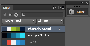
Jump into Adobe Kuler's color scheme library and choose one that calls out to you. Or if you have Illustrator installed, access the Kuler panel. You can sort by 'Highest Rated' or 'Most Popular'. Remember that your goal is to create a design that reflects your personality. If blue is your favorite color, then choose a color scheme with a blue that you like.
Choose fonts
My article, The Best Free Fonts and How to Use Them, has some great information about obtaining free fonts and how to use them. Google Fonts and DaFont are two of my favorite places to grab free fonts. You need to choose at least two fonts. If you're not sure which ones you can refer to the following articles that list the best Google Font combinations:
- Just My Type
- Top 5 Recommended Google Font Combinations
- 10 More Awesome Google WebFont Combinations to Try Today
Step 5: Design
This is the part that can get tricky. What original, creative idea do you base your entire resume on? How can you do something awesome like Francesco's resume? First I need to point out that Francesco's and Varun's resume, although inspiring, are vertical resumes for digital viewing only. A resume designed for print has a limited work space. It's more challenging to come up with a cool idea under the restriction of a regular white sheet of paper.
Who are you?
Let's roll back to step 1. Think about why you're creating this resume. What personality do you want to show with the design? Who are you? What do you like? What things do you think are cool?
Are you obsessed with music? Maybe come up with a theme related to music. Do you take pride in being an Apple enthusiast? Maybe choose a theme about what you like about Apple. Love super heroes? Theme it to them. What's important is to make your resume FUN. Fun is what sticks out to potential employers as they flip through a pile of boring, average resumes.
Suggestions
- Keep text minimal. I recommend focusing on a 50:50 ratio between text and imagery, or even a 40:60 ratio. Since this is a designed resume we want to focus on filling it up with beautiful, eye-catching aesthetics.
- I think it's safe to exclude job descriptions. You can have job descriptions in your LinkedIn profile and portfolio site. How come? Well, think about it. If you're a web designer then you've made websites for every job. Why repeat “I made websites” for each job when you can consolidate “Web Design” as a single bullet in the Skills section? Excluding job descriptions will leave you with plenty of valuable real estate for more important things.
- Other designers will beg to differ with me on this one. I do not recommend listing your skills on a chart with a fixed score of how knowledgeable you are with each one. I feel like it sets in stone your potential with your skills. For example, if you score yourself 5 out of 10 for Illustrator, I think that suggests to your potential employer that you're set to always have average skills with Illustrator. I think it's better to just state Illustrator with no score. If it turns out you have average skills with Illustrator but your new job requires an expert, then buy a book or look up tutorials and you'll become an expert in less than a week. I don't see a benefit toward suggesting a lack of potential.
Be mindful for print
- The background must be white. Be mindful for the ink supply of the potential employer’s printer. Plus a white background is easier on the eyes. If you must have a background color, choose a very light color or cover it with many white background boxes.
- Be careful with small font sizes. Everything must be perfectly legible.
- Make sure the colors you use are friendly for black & white printing.
You need to use Illustrator
By the way (and this should go without saying), you have to create your resume in Adobe Illustrator. Illustrator is designed for this very purpose, and as a designer, you must know Illustrator. I suppose you could pull off designing your resume in Photoshop, but I don't recommend it because Photoshop wasn't designed for this. If for some reason you do not have Illustrator you can use Illustrator CS2 (which is free), Inkscape (open source vector drawing), Scribus (open source desktop publishing), or sign up for the Adobe 30-day trial.
Step 6: Quality Assurance
When you finish your resume you should obsess with it, because it's not 100% finished yet. Make yourself some coffee, sit back, put on some music, and stare at your resume. Stare at it for at least 10 minutes. Absorb everything you did.
- Make sure everything makes sense.
- Make sure everything has proper spacing.
- Make sure everything is relevant.
- Look for typos.
- DOUBLE-CHECK ALL PHONE NUMBERS, EMAILS, AND WEB ADDRESSES.
- Think carefully about what information to add or exclude.
Get everyone involved
Have your family and friends read your resume. Pass as many eyes as you can over it. If your parents are confused by something, don't pass it off as “Well they don't understand my industry so I won't take their feedback seriously...” - that's not true. Everyone's feedback is important.
Print test
When you print out your resume:
- Make sure everything is legible. Your smallest text needs to be perfectly legible.
- With color printing, make sure certain colors don't look 'fuzzy' when printed, due to cheap printers struggling to match the color. For example, if you have a thin headline in orange it might look funny from your printer bunching together red and yellow dots. In that case, you could darken the orange so that your printer throws in more red dots and maybe some black.
- With black & white printing, make sure all your colors translate well to greyscale. Similar to the dilemma mentioned above, be careful with using light grey with text (or colors that appear as light grey when converted to greyscale). Making colors darker would reduce the fuzzy grey look.
My Resume
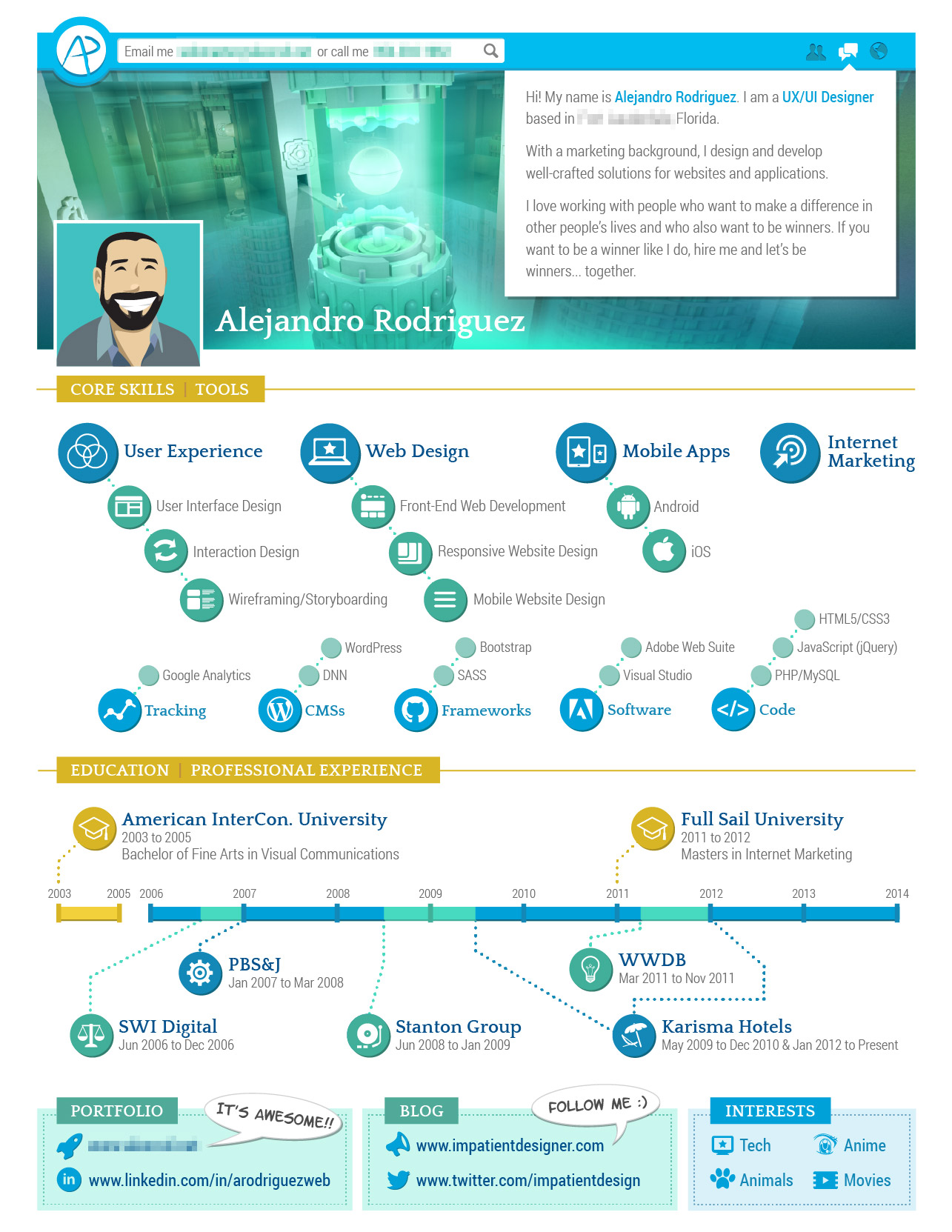
Here's my resume I finished at the time of writing this article (I design a new resume every year).
The Header
I had trouble coming up with an original idea. I pride myself as a designer who also knows marketing, so I decided to mimic Facebook a bit since that's a core area of marketing. Almost everyone out there is an active user on Facebook. I figured when someone flipping through hundreds of resumes comes across mine, the Facebook imagery will catch their eye. Hence, reminding them of Facebook and entice them to check out my resume.
My Skills
I had a difficult time deciding how to present my skills. At first, I was using Paola's approach. I was even putting “User Experience” and “User Interface Design” next to each other as Paola did (like this). As I was trying to figure out what to put as an 8th skill, I realized that it didn't sit right to have User Experience and User Interface Design right next to each other. As I pointed out in my article, What Exactly Is UX Design, the web industry has a highly fragmented understanding of what 'user experience' is. UI Design is actually a subset of UX Design, and I wanted to make that clear as I presented them as my skills.
Then I decided to display my skills as a visual outline, in such a way that I could put second level bullet points. It worked out. This approach also helped me decide how to show my technical skills because I was quite stuck with that as well. In my original vision, I had my bubble bullet points freeform (like this). Later I decided a more organized approach looked and read better.
I drew all the icons myself. However, they're not all original ideas. I looked at Google Images for inspiration. For example, for marketing icons, I looked up “marketing icon.”
My Education & Professional History
I fell in love with Paola's approach with a timeline. I blatantly copied her idea in this area. It's such a neat, clean, and organized approach.
Contact
I'm just listing my contact information with decorative icons. I grabbed a few of these icons from the Entypo Suite. I thought about adding some cartoon talk bubbles to give this area a spark of fun that stands out.
Weaknesses
My resume does have its weaknesses that I'm accepting/enduring for the higher purpose.
- My name isn't at the very top, nor is it immediately clear. I'm betting on the Facebook-like layout to grab peoples' attention.
- My email address and phone number are small and in an unconventional place at the top. Again, I'm betting on the Facebook-like layout to draw people in.
- I'm using 3D artwork in the header when 3D isn't very relevant to web design. A flat design illustration probably would've been more effective. I'm taking a risk, hoping that potential employers would appreciate my expanded skill set.
- In my Skills, it's not very clear that the first level bullet points aren't limited to the second level bullet points. This isn't too important; I'm betting on making it clear on my portfolio website (and in person) that I'm capable of more than what I posted on my resume.
- I don't have a single consistent style. Technically I'm combining 3 styles: the Facebook-inspired header, the bubbles for skills/work history, and the boxes in the footer. The overall layout would look cleaner if I stuck to a single style. It was difficult, though, squeezing everything into one page. Using different styles made creating my resume easier.
I believe in the power of being (constructively) self-critical. Never settle and get comfortable with your designs. Always strive to be better. As you just read, I have quite a list of complaints about my resume already, even though I'm considering it finished.
Conclusion
In this article, I discussed my recommended set of steps toward making a great resume. Starting your resume by making a plan makes a world of a difference. I concluded the article by showing you my recently designed resume. I broke it down to show you my thought process with each section.
I hope I was helpful in guiding you for your resume. Creating a designed resume can be a time-consuming challenge. Every second spent is worth it, though, because you're showing potential employers how talented and awesome you are. Good luck!