How to Make Awesome Websites: Part 1
This article is part 1 of a 2-part series. To make an awesome website you need to do more than just jump into Photoshop and push pixels. It takes more than just using the latest trends such as Bootstrap and parallax animation effects, just because everyone else is using them. If you really, truly want to make an awesome website, it takes an intimate understanding of the fundamentals of design, understanding the origins of what's popular, and establishing proper planning.
The steps discussed in this article are what serious advertising agencies go through to make high-quality websites. However, I'm going to tone them down to practical approaches because I understand most of you reading this are solo or working in a small team. Or even working under a boss who's not a designer and they don't care how you make a website as long as you get it done.
This article is inspired by Giovanni DeFeterici's The Web Designer's Roadmap. I highly recommend his book. If you find this article useful, more so I recommend the book for learning more about these topics.
I'm going to begin by taking a step back and dig deep into what it really takes to make an awesome website.
Mathematical Beauty: The Golden Ratio
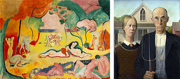
What can you do in a world where 'good design' is highly subjective? What is beauty? What example can you follow to always make a beautiful design? To answer that question we need to turn to math. Beautiful proportions are defined by the golden ratio. Basically, the golden ratio is the result of placing a square inside a rectangle again and again and again, as many times as the design can reasonably contain. The golden ratio makes sense when you place its wireframe over objects of beauty:

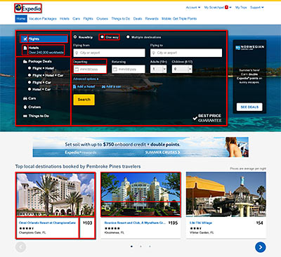
Let's take it a step further and apply the golden ratio to a popular, common website. Below I've applied it to Expedia. Not everything works out to perfect squares, but I'm sure you get the idea.
From website layouts to even the most minute details in design elements, they are beautiful when they can be broken down into golden ratio grids. Here's a good article where you can learn more about this subject: What Web Designers Can Learn from Art History.
What Matters Most: Beauty or Usability?
The very instant you look at an object, the sense of beauty you feel is called perceived beauty. It's your immediate judgment before you get a chance to let your impression sink in. Perceived usability is your impression of how easy you think a website or application might be. So which is more important: perceived beauty or perceived usability? It varies from person to person. Knowing your audience is critical in this regard.
User experience studies found that users place a great deal of weight on whether or not they find a design beautiful. You might be saying “Well duh, I could've told you that.” Well, user experience studies also found that users increasingly care less about the beauty of a design as they interact with it. In other words, beauty is priority one at first, then usability becomes priority one.
Copying Other Designs
We all do it; we all copy the work of other designers. It can't be helped. You have a deadline and your boss/client is expecting awe-inspiring award winning designs from you. It's hard to come up with something original with such an overwhelming amount of websites out there. Copying, however, can benefit you if you learn from other designs. If you just copy other peoples' ideas then you'll never grow. You should take the time to study a design and ask yourself why the designer did certain things. “Why is that box red? Why is the navigation so minimal? Why is the font sans serif? Why does that section have pictures and the other has icons?”
The Secret to Success
I will never forget this story that the dean of my university once told. The story was about a co-worker who was always stressed and overwhelmed with his daily responsibilities. This co-worker would begin his day saying “I'm going to have a terrible day!”, and the day was indeed terrible as he anticipated. The dean suggested purchasing a notebook organizer to make a list of his responsibilities organized by priority. Ever since then the co-worker was no longer stressed out.
The path to success begins with getting organized! Prioritize your responsibilities to create a stress-free environment so you can focus on your creative juices. More specifically, to make an awesome website you need structure. I recommend the structure suggested in the following four steps.
4 Steps to the Website Creative Process
Step 1: Brainstorming
There are many ways to go about brainstorming. It doesn't matter what you use: a piece of paper, whiteboard, Microsoft Word outline, pen tablet - use whatever medium you're most comfortable with that will allow you to easily jot down any idea that comes to mind about your website. My article about being more creative would help here: 6 Practices for Brilliant Ideas.
Step 2: Ideation
Review the ideas with others. Pick out the ones that resonate the most. You've got a winner if people react with “This would be cool with...”, “If we used this idea we can do this and that...“, “I know our audience would like this idea because...”
Step 3: Evaluation
This is the first critical analysis. Bring out the list of requirements for the website and rigorously grade your ideas based on them. Your goal is to leave only a couple of ideas left on the table. With each idea, the key is to find the sweet spot between the following:
- Business considerations. Does the idea agree with the needs and wants of the business?
- Creative ideas. Is the idea creatively appealing? Would it dazzle and attract the audience?
- Realistic implementation. Is the idea realistic? Do you have the time, budget, and resources to bring it into fruition?
If you can't find that sweet spot between business, creative, and practicality then that's a sign that the idea should be scrapped.
Step 4: Conversion
Prepare some sketches based on the remaining ideas. Quickly make some thumbnails or rough wireframes. This step may take a while, but it's essential because sometimes an idea loses its shine when it's put on paper. This step also helps you find out if there are holes in your idea. If that's the case then jump back to the brainstorming step to refine the faulty idea.
Importance of Talking to Clients
I know, this one is common sense (or is it?). Clients know their audience well. They have detailed knowledge of subjects we never think about. During conferences, they may not think of everything about their product/service to tell you. Try to probe clients more than what you're used to doing to get more insight out of them. This is especially important if the product/service is a genre you've never experienced.
I'm guilty of slacking in this area in my younger years. I once made a website for an indoor trampoline park. I've never been to one in my life. During conferences, I mostly listened to the client. I didn't ask questions about the audience or the trampoline experience. The result was an average website. Now that I know better, I would've taken a completely different approach, starting with my interaction with the client.
Stepping Outside of Your Comfort Zone
While it's great to browse design showcase sites for inspiration, you can't always make awesome websites if you always rely on such sites. You should try to step out of your comfort zone and try other areas for inspiration. The author of The Web Designer's Roadmap found inspiration from physics books. I found inspiration from classic video games and anime. A design problem never has an absolute solution. The more areas of inspiration you've found, the more options you create for yourself with your work.
The Dangers of Latest Tech
Keeping up with the latest technology is a good habit. Bootstrap is all the rage now for responsive websites. Or better, why bother using Bootstrap when you can use Adobe Muse to create a responsive site without any knowledge of code. These days you see full-screen videos, parallax animation effects, and flat design styles left and right. These solutions are great, but they may not help you make awesome websites. The problem comes in when you're using these technologies/trends without understanding the following:
- How they work. Before you rely on a technology to automate something, know that you can create awesome websites if you understand how that technology works if you didn't have the luxury of automation. For example, I like to use Bootstrap. Bootstrap, however, isn't a one-size-fits-all solution for responsive design. Because I took the time to study creating responsive sites from scratch, I'm able to add custom responsive features to my Bootstrap driven sites. I'm able to create something better instead of being limited by what Bootstrap offers.
- Why people use them. As your parents told you when you were little: “If everyone jumped off a cliff, would you jump off too?” Using new technologies/trends just because they're all the rage doesn't guarantee results. Even worse, they could have a negative impact on your website. It's important to understand the purpose of using them.
- When it's appropriate to use them. It's equally important to understand when and where it's the right time to use the latest technologies/trends.
Taking the time to do some research goes a long way. I'll give you an example of a blind decision that was made in a previous job. They loved to create websites with full-screen slideshows on the homepage every single time. They didn't do it for any real reason, besides being a popular design fad that impressed the HiPPO. Did you know that slideshows can hurt your website? That doesn't mean slideshows are a bad idea, they're just not always appropriate. In addition, large or full-screen slideshows require photos with minimal noise. Otherwise, the slideshow would be a distraction (and hard on the eyes) from the rest of the website. They would slap any photo from the stock folder in the slideshow, no matter how noisy. Here's an example of what I mean:
Art History That Inspired the Web
There are three movements in art and design that have inspired today's web design. By understanding the root of what inspires the web, you can create awesome websites.
Arts and Crafts movement

The Arts and Crafts movement “...stood for traditional craftsmanship using simple forms and often applied medieval, romantic or folk styles of decoration.” This movement inspired web design because web designers try to somehow connect reality and nature into website designs. It inspired a need to apply a sense of texture to designs.
Minimalism

Minimalism “...refers to anything that is spare or stripped to its essentials.” Minimalism along with a need for user-friendly layouts gave birth to flat design. Web designers use the minimal style to create designs that don't interfere with the content. Minimal design doesn't mean creating simple, boring layouts. Proper use of color, spacing, and white space could create powerful, beautiful designs.
Modernism & Postmodernism

Modernism “...includes the activities and creations of those who felt the traditional forms of art, architecture, literature, religious faith, philosophy, social organization, and activities of daily life were becoming outdated in the new economic, social, and political environment of an emerging fully industrialized world.” And Postmodernism “...includes skeptical interpretations of culture, literature, art, philosophy, history, economics, architecture, fiction, and literary criticism.”
This is a heavy subject to cover briefly. I'll just say this: everything you create now is postmodernism. Referencing older styles and molding them for your work is a postmodern approach to design.
Lessons from Print
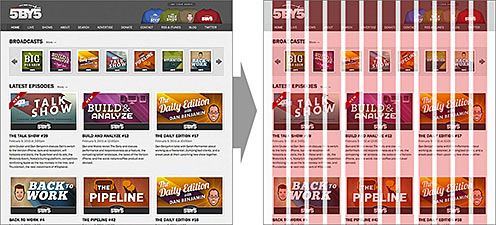
The web owes its design patterns and theories to print. Just as column grids were the backbone of newspapers, they are also the backbone of websites:
Part of having an awesome website is having its content organized in a grid system. Print also taught us information hierarchy. Hierarchy is very important. The young designers I've worked with had trouble practicing hierarchy. When the proper hierarchy is established, websites are easier for users to scan through. Default HTML emphasizes on hierarchy with heading 1 <h1>, heading 2 <h2>, heading 3 <h3>, etc.
Conclusion
Now you see how the fundamentals of design and the creative process have an impact on making awesome websites. In the next article, I'm going to touch on UX, color scheming, the later stages of planning, wireframes, and other important topics.
Continue Reading “How to Make Awesome Websites: Part 2”


