


 Published September 2, 2016
As I explained in my article, What Exactly Is UX Design, “UX” is not so simple as to just follow best practices and call it a day. It takes thorough research and planning. But, yet there are still some really good best practices out there that any web project can benefit from. The following is a collection of what I think are the 10 best best practices for UX/UI design.
1. Consolidate similar functions instead of fragmenting them
This is a story we can all relate to. When a project has many hands in the pot, everyone wants their stake in it. In the effort to satisfy everyone, over time we might have unintentionally created multiple sections, elements, and features which all perform the same function. It's an easy mistake to make, especially in large projects. UI fragmentation causes a higher learning curve for your uses. Try to merge similar functions together.
2. Keep consistency
While it is tempting to make layouts more exciting by adding more color and visual elements, you must do so strategically. If blue is designated as the anchor link color, don't make it a heading color as well. All links and buttons should be distinct from each other. We want to clearly communicate to our users the visual cues of our layout. All visual elements need to be instantly distinguishable across every screen. You don't want to force users to relearn your layouts as they move through them. Creating a solid style guide is essential for keeping all styles consistent.
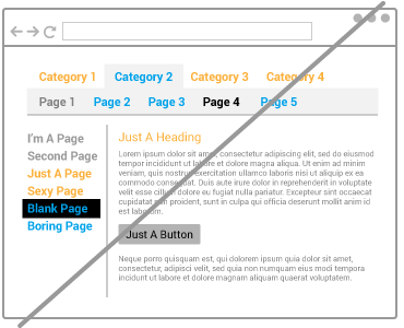
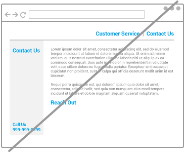
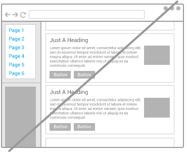
3. Add more contrast and reduce similarity
Contrast makes a world of a difference. If your layout has too much similarity, elements can get lost. This can become a serious problem if the element that gets lost is a button you want users to click on. The user should be able to instantly distinguish the conventions of your layout. See below: the turquoise, black, and white areas clearly separate the header, navigation, and content area.
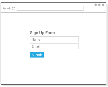
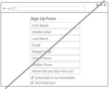
4. Keep form fields to an absolute minimum
The “less is more” principle couldn't apply more to the question of how many form fields should be in your form. Steve Krug's Don't Make Me Think drills this notion into you. The fact of the matter is that people are lazy. We're on the Internet to relax. We want to do as little work as possible when filling out a form. If the user feels intimidated by your form in any way, they're going to give up and leave.
We also need to keep mobile users in mind. They don't have the luxury of a physical keyboard to be filling out your forms. They less they need to fill out, the better.
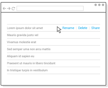
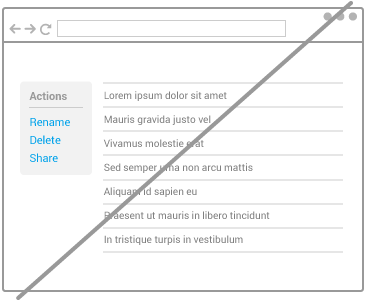
5. Try direct manipulation instead of contextless menus
This has become an increasingly popular strategy as UX/UI design moves more toward keeping layouts simple. When your layout presents actions for managing a list or gallery of content, it can help to hide those actions to be revealed upon click or hover states. Layouts can get quickly messy or noisy if you try to show options or actions for every single item. So hiding them only when they're needed is a great way to clean up your layouts. Outlook.com's recent revamp exercises this idea very well.
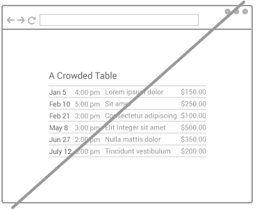
6. Reduce visual noise
Borders, boxes, pictures, multiple backgrounds... too many in close proximity makes a layout too noisy! These visual elements compete for attention with real content. If you want your users to be reading something or clicking something, help them reach it by reducing the obstacles in their path. Try giving your layouts the blur test. The purpose of the blur test is to see if people can immediately recognize the conventions (header, navigation, content areas, etc.) of your layout if everything is blurred.
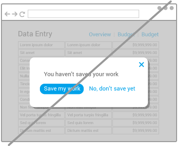
7. Modal windows must die
Modal windows are annoying and highly intrusive. We all hate them when they're used for marketing purposes. They still have their purpose, though. In applications, they must be used strategically and as a last resort. Whenever you're skirting with the idea of adding a modal window, try to think of a softer alternative first.
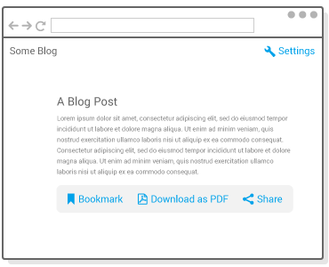
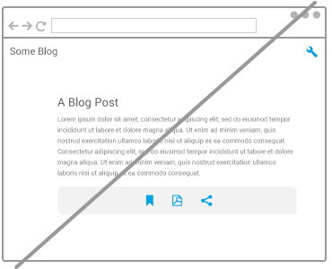
8. Be careful with icons
We are in the age of icons. Icons are wonderful. They're fun. They're an easy way to simplify layouts. However, they come with a drawback. Not everyone will immediately recognize every icon you use. Take an “X”, for example. Does it mean to delete, disable, or close? Or how about a down arrow icon - does it mean to move something down or download? A great way to prevent confusion is to accompany icons with labels.
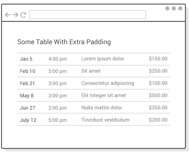
9. Extra padding goes a long way
Part of the process of making your layouts simpler is to enhance readability. When elements are too close, you run the risk of them blurring together into indistinguishable wholes. When elements are slightly separated away from each other, they begin to be allowed to be perceived individually. This can be good for lists, tables, paragraphs or any sets of elements on a screen.
Spacing also helps as a great design strategy to establish a layout's hierarchy. For example, extra spacing can nullify the need of distracting borders (as mentioned in “6. Reduce visual noise”). This article expands on the subject: How To Use Space In Design.
10. Use the standard tools
Our time is valuable. If you're not using the best tools for UX/UI design, you could be wasting a lot of time!
Sketch + InVision (Mac)

UX teams use Sketch and InVision as the standard duo. Sketch is an app only for OSX. It's the best tool for designing pixel-precise layouts for web and mobile apps.
Sketch has lots of features, but there are two in particular that made it king for UX. Sketch can tell you exactly how many pixels away an object is from a bounding box or another object. Also, Sketch can easily export any object in a variety of formats. It can export the object itself or its associated CSS styles. This feature is essential for developers when it comes time for them to convert designs into code.
InVision is the best website for team collaboration on designs. It also lets you turn designs into interactive prototypes.
Adobe XD + InVision (Windows)

Adobe XD (Experience Design CC) is Adobe's answer to Sketch. It was released on Windows in late 2016. It can do everything Sketch does, and more! Most notably, it can create repeat grids (smart duplication) and interactive prototypes. And then jump into InVision for team collaboration.
Further Reading
Want to learn more about UX/UI Design? I recommend the following books:
- Don't Make Me Think - A great introduction to UX and best practices. It's an easy read with fun illustrations and examples.
- Designing with the Mind in Mind: Simple Guide to Understanding User Interface Design Rules - This isn't a formal UX Design book. It focuses on cognitive psychology and UX best practices. It's the perfect book to read after Don't Make Me Think.
- Killer UX Design - This book is for people who are serious about learning UX Design. It focuses almost entirely on research. Because when it all boils down, research is the key to the most successful UX Design.