4 Lessons I Learned as a Designer Who Studied Marketing

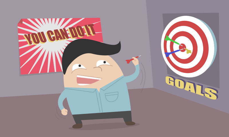
Aim for the goals!
I've been involved with web design for 18 years now, so I've 'been around the block' watching it mature. It's incredible to think about the whole picture to appreciate how far web design has come from old trends and old technologies. Before I discuss what I've learned from studying Internet Marketing, I want to run you through my background as to why I made the decision to pursue it.
My story
For the most part, I've been an in-house designer. Such environments normally have an untraditional web team. My boss was either the senior graphic designer, the office manager or the IT manager. In my first job, I worked with a team of web designers. In all my jobs after that, I was the only web designer in the company.
In my early years, it was challenging to work with bosses who didn't specialize in web. Every decision I made with my website designs had to be sold to them. This was tough because I didn't have strong arguments to justify my design decisions. In other words, I was designing without purpose. I slapped designs together just because they looked pretty. What would usually end up happening was that my boss/client would present websites they liked and expect me to replicate them. The era wasn't helping my inexperience either. Ten years ago there wasn't as much support and resources for web design as there is now. The concept of “usability” didn't really exist.
As the years went by my skills matured and I started designing with a purpose. I began presenting designs of my own devise well suited to the product, instead of just copying the websites that my boss/client liked. It was until later jobs working with marketers that I began to intimately appreciate designing with a purpose. Marketers opened up a whole new world to me. I was fortunate enough to work with marketers who aggressively sought out feedback, encouraging me to regularly exercise thinking about purpose. I enjoyed having an active role in the creation of a website instead of just sticking to my sole role of designer. My experience with marketers grew a mountain of questions in the back of my head. I wanted to learn more about designing with a purpose. I grew tired of “guessing” what customers wanted in a website.
Hence, I went to school to get a degree in Internet Marketing. It was one of the smartest decisions I've ever made in my life! At first, I was worried that pursuing marketing wouldn't be worth it because I wasn't doing it to switch careers. Surprisingly, what ended up happening was that marketing propelled my web design and programming skills to higher levels. It was like I had an epiphany. If my skills were like an MMORPG, I went from level 20 to level 60 in less than a year. Setting up a PLN (which my marketing school encouraged) especially played a role in my speedy growth.
So what happened? What did I learn with Internet Marketing that helped me grow so much? I'll break it down.
1. Do everything with purpose

Experience taught me to design with a purpose, but marketing taught me to do everything with purpose. Before, I made a button red for the purpose of making it stand out more. Now I make a button red because it's the color that attracts the target demographic the most. It's the color being used to establish the e-commerce funnel toward the goal. It's the color that had the most conversions in the A/B testing, and so on. In other words, I no longer say “I think red works best for the button.” Rather, I say “Red works best for the button because of x and y in our research.”
Key takeaway: Always think several steps ahead and consider the whole user experience for every decision.
2. Revolve everything around goals

Similar to above, marketing taught me to always establish goals and to think about them with every decision made with the website. This is important because it's easy to forget goals and make decisions based on personal taste and myopia. ('Myopia' in the context of web design means limiting your perception to only how you personally use the web.) If the goal is to get customers to sign up for a service, I intimately think about how every element in a layout contributes to directing customers to sign up.
Consider this scenario: you're a designer with 7 websites on your plate. It's 6:45 PM (you normally leave at 5) and you're drained. Your boss comes up to you and asks how you're going to approach designing a new section that the client decided for the website at the last minute. At this moment probably the last thing you want to do is consider goals to give your boss an informed answer. You're more concerned about what you're going to do for dinner. My point is: even during moments like this you should consider goals. To manage considering goals when your brain is dried up means you will religiously consider goals when it's not dried up. You know what I mean? I'm talking about exercising goals so much that you never consider them a burden.
Key takeaway: Actively think about goals to prevent decisions based on personal taste and myopia.
3. Guided feedback is essential
Upon studying marketing, I realized how terrible company meetings were that reviewed a website in production. What usually happens is drafts of the website are presented in a PowerPoint of 5-20 slides, and then the question is asked “Do you like it?” No one brings up the purpose or goals of the website. No one considers how a typical customer would use the website. Just asking: “Do you like it?” invites an opinion based on personal taste. The question also puts everyone's attention on the homepage and if it has any wow factor, since that's the page everyone cares the most about.

Meetings aren't the only problem either. I'm talking about design by assembly in general when there's a group of people who have their hand in the pot for approving a website. There's always that person who has their wife's friend's second cousin's third uncle's mother-in-law who insists on the website to have lens flares and kittens. Whether it be meetings, email threads, phone conferences, etc. - all have high potential to hurt the website with unguided feedback.
Marketing taught me to take control of meetings by presenting a list of goals and explaining how the website meets each one. After all, the whole point of creating a website is so that your boss or client can increase profit. What better way to get that point across than to break down how it will increase profit. Feedback based on personal taste is okay as long as whoever gives it understands what the website needs to accomplish.
In addition to guidance, often times the client needs to be educated. It's a delicate procedure since people buy on emotion and then they justify it with logic. This Sitepoint article explains the best way to do so: The Correct Way to Educate Clients.
Key takeaway: Help prevent misguided feedback by reviewing the goals of the website to remind decision makers of its purpose.
4. Question fads
Before learning marketing I might have placed a slideshow on the homepage because slideshows were the fad. Or maybe my boss or the client insisted on having a slideshow. Whatever the case, everyone was sold on the slideshow. Now fullscreen videos and parallax scrolling animation effects are the big fads. The wow factor is high with them so they're easy to sell to clients. What can give a better impression more than an awesome fullscreen video auto-playing as soon as you enter the website?
Marketing taught me to question fads. As impressive as slideshows, fullscreen videos, and parallax animations are, they could potentially harm the website by deterring users away. In fact, having anything auto-play is potentially harmful. However, that doesn't mean slideshows and fullscreen videos are bad and you should never use them. It all depends on your goals and your target audience to determine what design elements and design patterns best suit the website.
Key takeaway: Try to avoid doing something just because it's popular. Review the goals and consider your target audience when deciding on what design element or design pattern to place on the website.
Conclusion
In this article, I gave you a background on my story as to why I decided to study Internet Marketing. I shared with you the most important lessons I learned as a web designer who dove into the world of marketing.
Marketing gave meaning to my work. I was no longer doings things just because. Marketing helps us understand the customer and give them what they want. My lessons are basically saying to never forget the purpose of the website because it's easy to fall astray in the effort to make everyone happy.
Further reading
Interested in learning Internet Marketing? Here's some recommended reading:
- Fascinate: Your 7 Triggers to Persuasion and Captivation - I love Sally Hogshead. This is pretty much a Marketing 101 book, but Sally makes it fun and easy to read. By organizing marketing concepts into 7 triggers, she makes advertising easy to understand.
- Always On: Advertising, Marketing, and Media in an Era of Consumer Control - An excellent, relatively short book that covers every area of Internet Marketing.
- The Brand Gap: How to Bridge the Distance Between Business Strategy and Design - A superb book about the proper way to create a brand. It's also relatively short.


